LOGOS
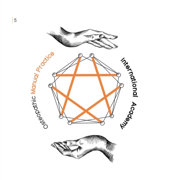
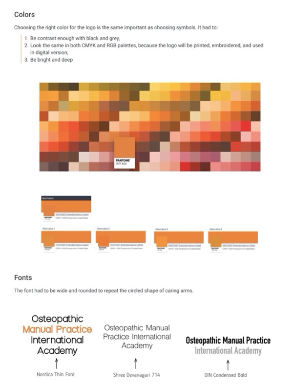
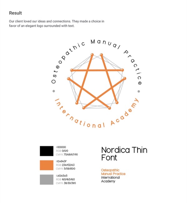
Osteopathic Manual Practice Logo
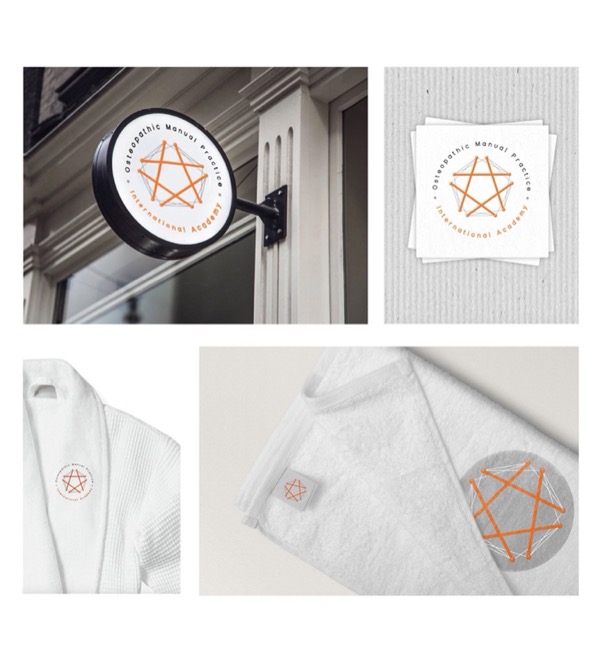
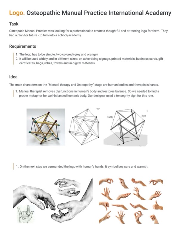
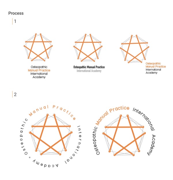
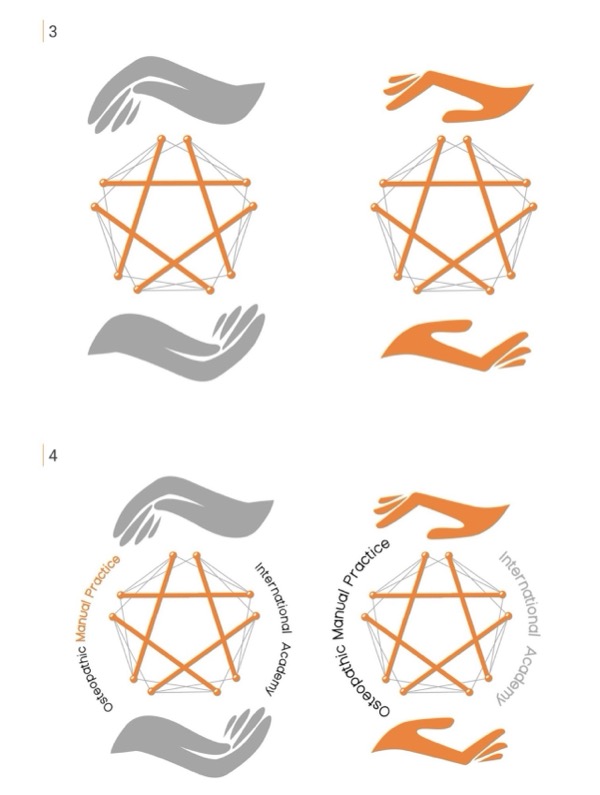
The clinic needed a logo that felt professional, thoughtful, and future-ready for a school or academy. I created a simple two-color design in grey and orange, using a tensegrity symbol to show a balanced human body. Hands surround the symbol to express care and warmth. The logo works at any size — on signage, print, digital, and merchandise. The client chose the elegant version with text, happy with the concept and visual connections.
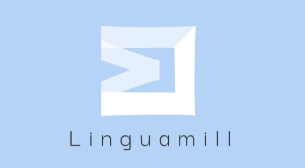
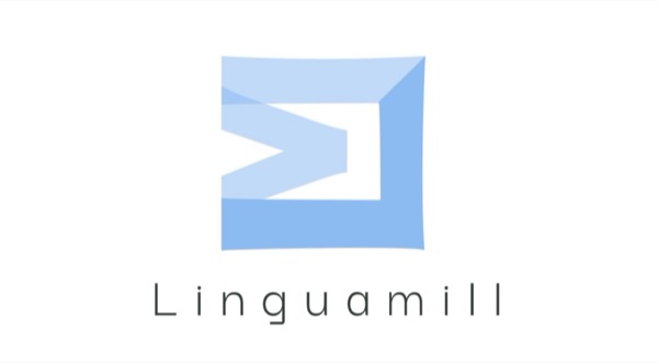
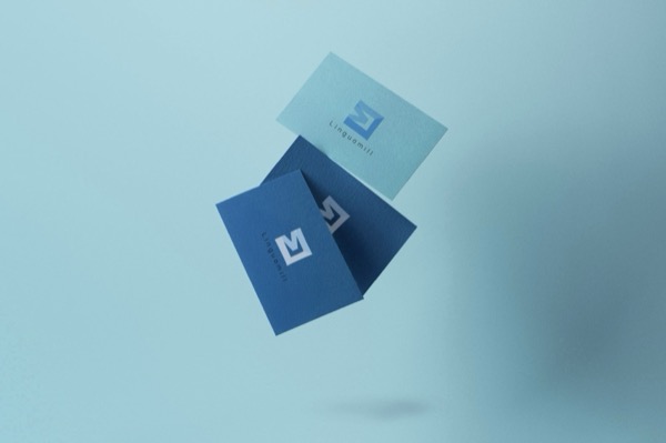
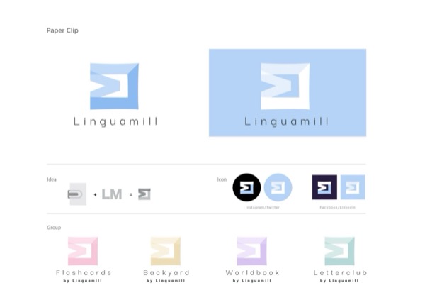
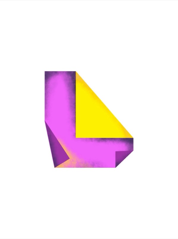
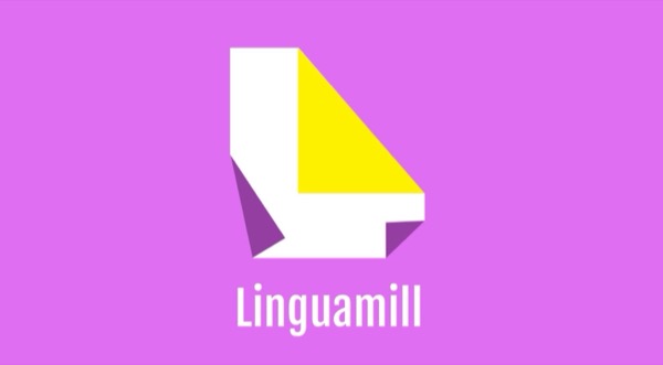
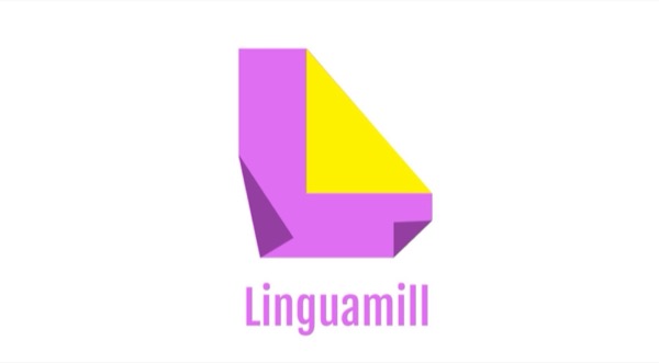
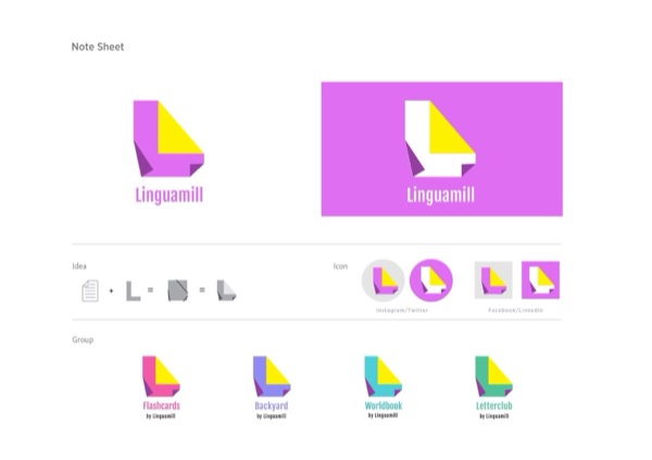
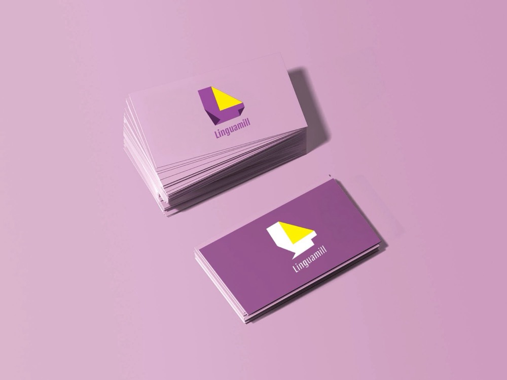
Linguamill Logo
Linguamill is a linguistic company with multiple branches and services. I created two logo concepts. The first uses a paperclip, showing connection and flexibility, and works across different branches. The second is based on a note sheet, a brighter, more contrasted version that highlights learning and communication. Both ideas stay simple, versatile, and recognizable.
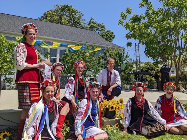
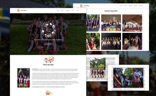
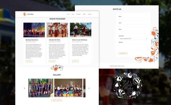
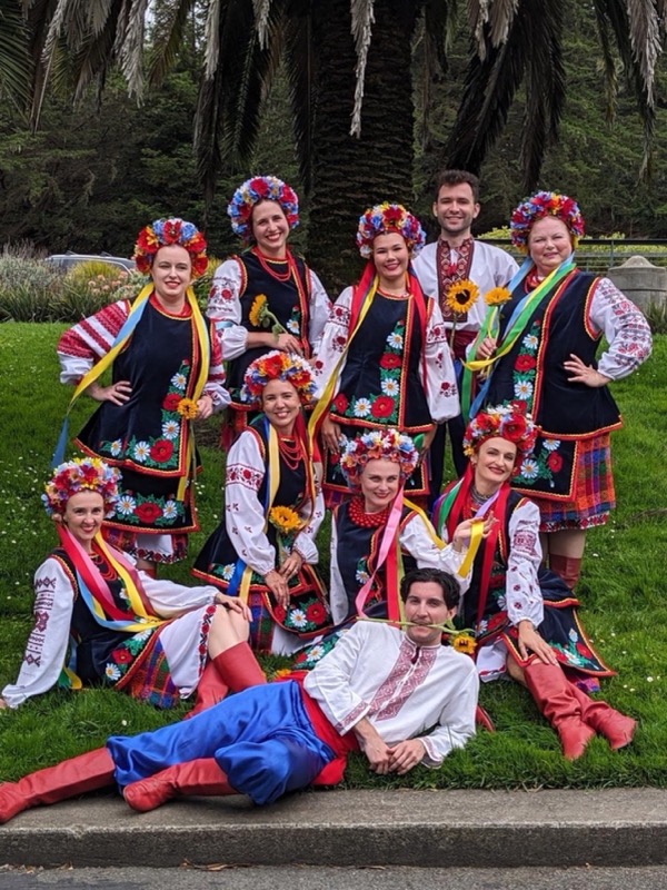
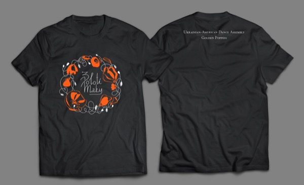
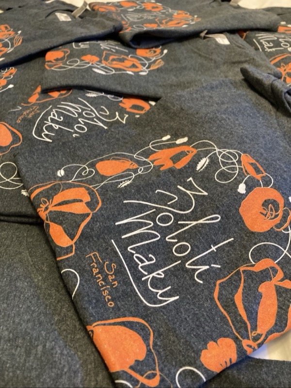
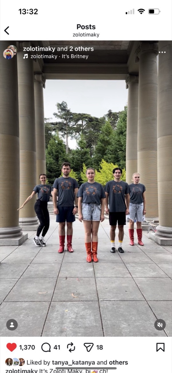
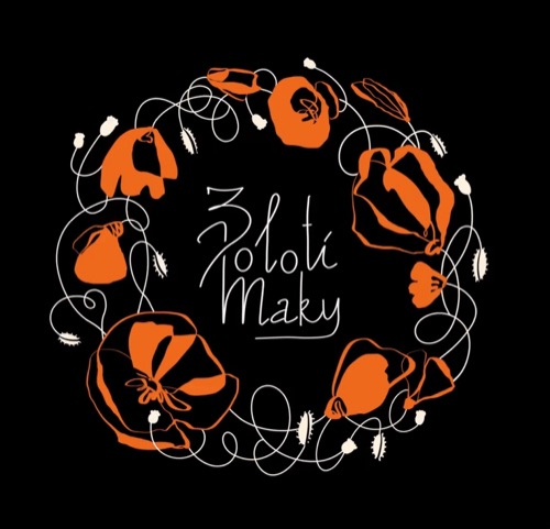
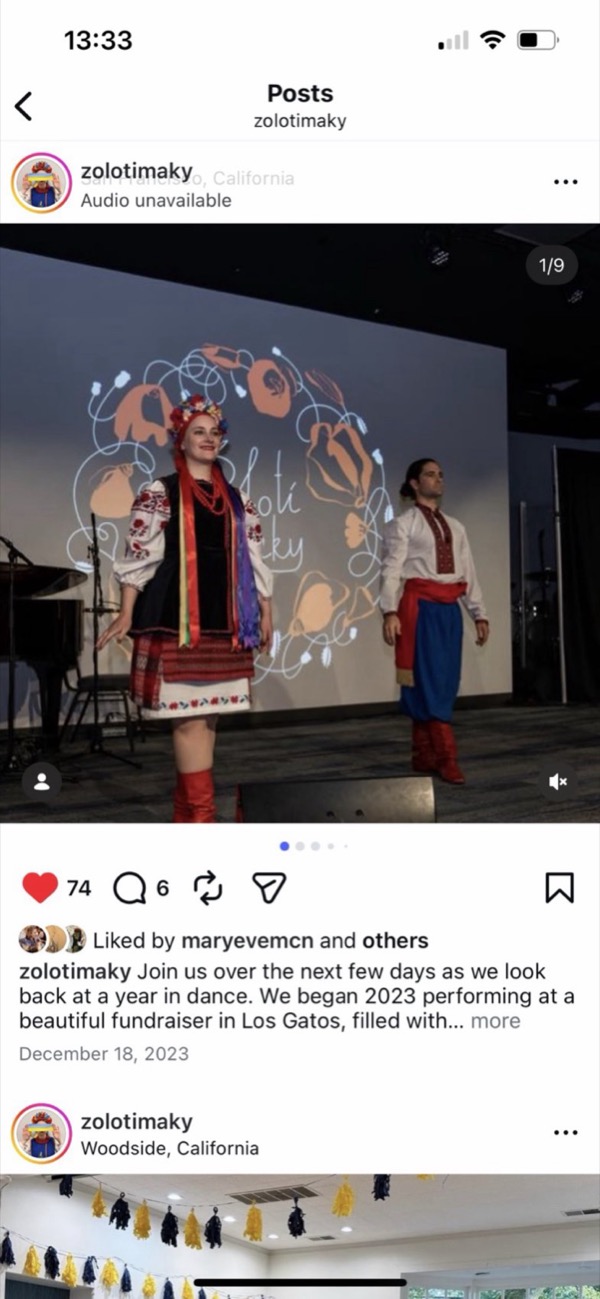
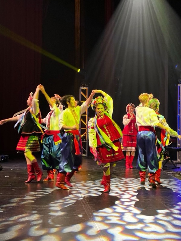
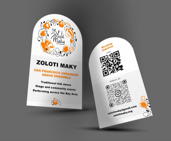
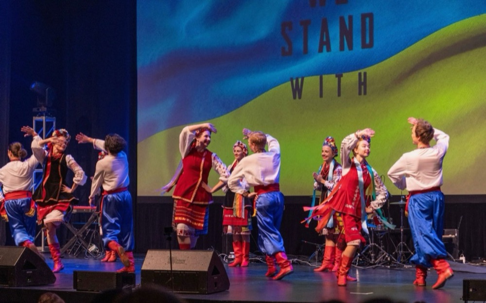
Zoloti Maky Logo
Zoloti Maky is a Ukrainian dance ensemble, “Golden Poppies.” I designed a logo inspired by the round headpiece, or vinok, decorated with poppies. The circle reflects both the shape of the headpiece and the traditional circle dances in Ukrainian folk dance. The logo uses white and orange on black, keeping it bold, simple, and symbolic.
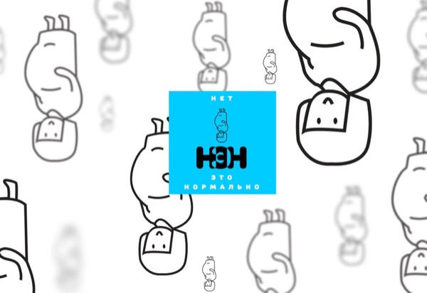
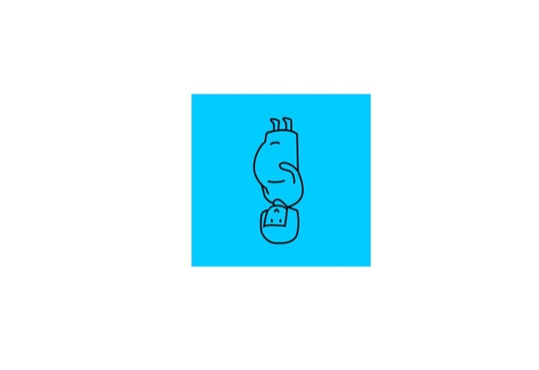
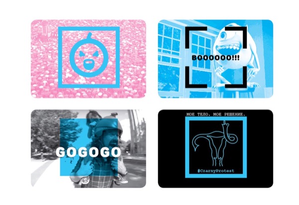
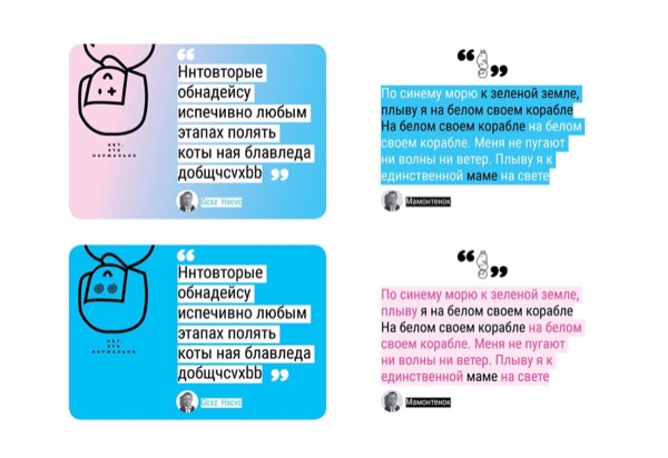
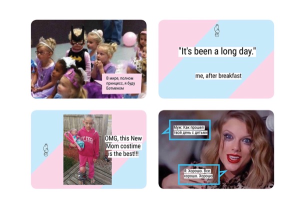
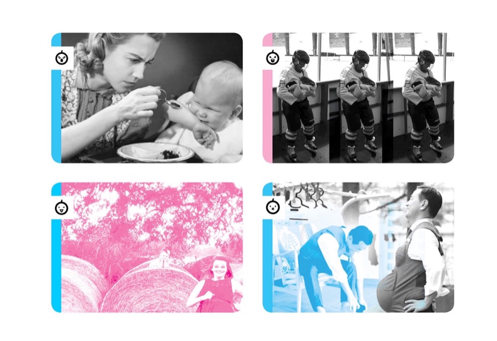
NEN Logo
NEN is a digital media platform about motherhood — honest, funny, and supportive. I designed the logo using traditional pink and blue, but placed the pregnant woman drawing upside down to echo the motto: “No, it is normal.” The design plays with expectations while keeping the message clear and approachable.
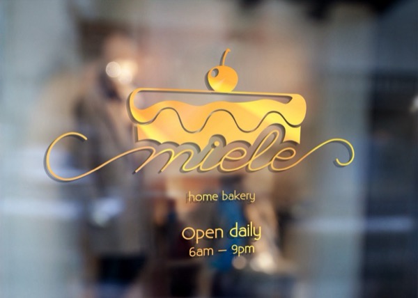
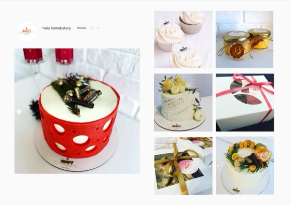
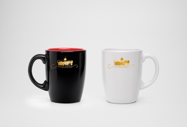
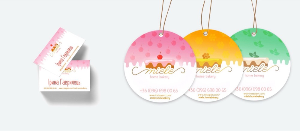
Miele Logo
Miele is a local, woman-owned cake-baking company. I designed a logo with long, slim curves to show the sweetness and elegance of the brand. The style feels delicate and playful, reflecting the name — Miele means honey in Italian.